In Stackfield, pages consisting of text, tables, and images can be created for filing information or for knowledge management. When used, these resemble conventional text documents. With our search functions, pages can be easily found with the text they contain.
Potential use cases for pages:
- Wiki / Guidelines / Things to know
- Blog posts
- Meeting notes
- Project planning
- Marketing plan
- Product requirements
Alternative: Files and directly in Stackfield Whiteboards
Readig tip: How to create an internal knowledge base with Stackfield
Creating a page
In the module Pages a new page can be created either completely from scratch or from a template by clicking the blue plus button in the upper right corner. A new page has a title and a description, which are not mandatory fields. You can name the page by clicking on the text field ("Type the title for your page...") and change the title at any time in edit mode. To avoid duplicates, use the module search (symbol: magnifying glass, top left).
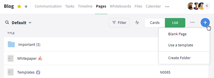
Click on the blue plus symbol to create a new page
Alternatively, you can create pages using the following modules and areas:
- Module Communication: Click on the plus symbol to the left of the text field and then select the option "Page" to create a new page
- Sidebar: By clicking the button "+ Create New" at the top of the sidebar you can create module entries via shortcuts ("New Page")*
- Global Search: Through the Control Center of the global search you can navigate through Stackfield, create module entries and much more
*The plus symbol at the top of the sidebar and the option "New Page" allow you to create a page centrally at any time. Attention: An additional field appears on the page, in which you can specify the room where the page is to be stored. By default, it will be the last room you visited.
How can I fill pages with content?
In a newly created page or a page opened for editing ("Edit this Page"), a representation can be inserted and the formatting of a text can be selected either before the text input or changed afterward by marking a text passage and selecting the desired option. By mouseover on the symbols in the toolbar, the respective function of the individual options will be displayed. The various options are explained in detail below.
Note: Page content can only be edited in edit mode, i.e., by clicking on "Edit this Page". If you are in edit mode, this button will change into the save buttons.
The toolbar at the top of a page
Font design options
Font
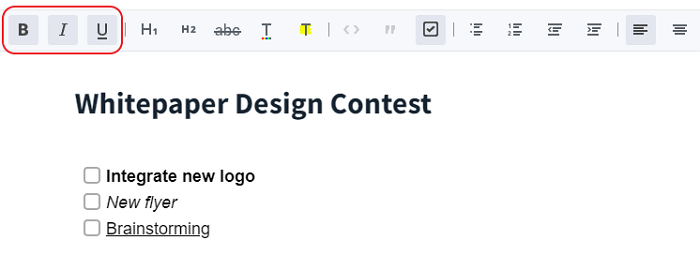
The options "Bold" (symbol: B), "Italic" (symbol: I), and "Underline" (symbol: U) are available for font formatting. You can activate a formatting function by clicking on it before entering the text (the respective symbol in the toolbar is then grayed out) and the text entered afterward appears in the selected formatting. If the text already exists, you can also format it afterward by marking it and selecting the respective option. By selecting the text and clicking on the option again, the formatting is removed.
Format text bold, italic or underlined
Strike through and color design
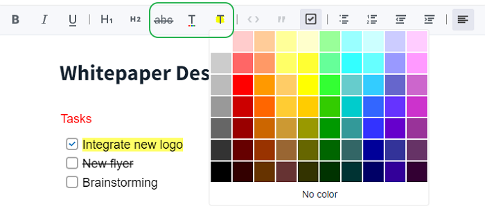
With the option "Strikethrough" (symbol: abc) you can display texts or words strikethrough. Clicking on "Font Color" (symbol: colored underlined T) or "Text Highlight Color" (symbol: yellow highlighted T) opens a color palette. By selecting the desired text, you can either change / remove its font color or highlight it with a color.
Strike through text and color it
Headings
By clicking on the H1 and H2 buttons you can create headings (H1) and subheadings (H2). By selecting and clicking on the respective option, you can also remove them again.
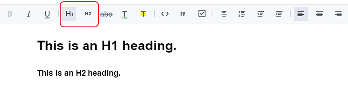
Create different sized headings
Structuring and visualization of content
Quotes and checkboxes
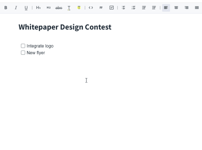
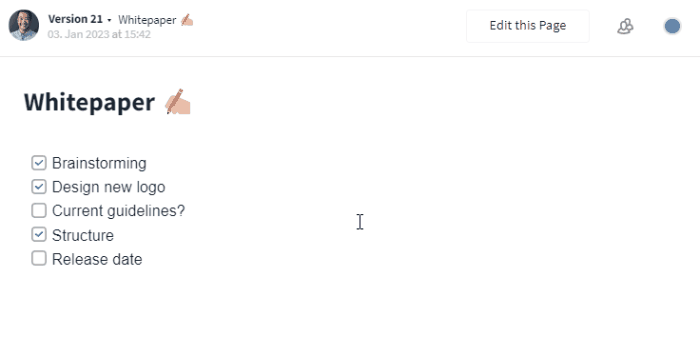
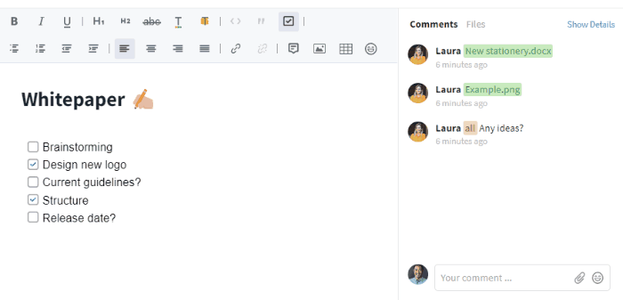
With the option "Checkbox" (symbol: box with a checkmark) you can easily create checklists and check off or uncheck individual items after completion by clicking on the box. Quotes are highlighted with the "Quote" option (symbol: quotation marks) by a gray line in front of the respective quote. (Tip: To check off all items per protocol, for example, use also page templates.)
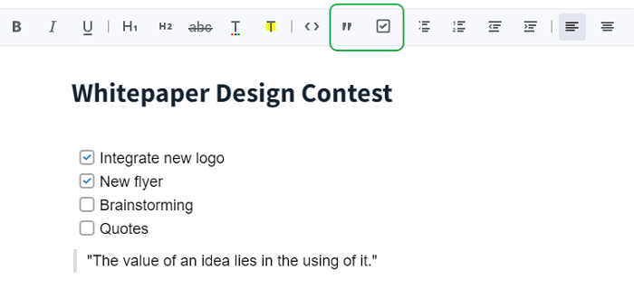
Insert checkboxes and quotes
Lists and indents
The options "Bullet list" and "Numbered list" are available for the creation of lists. By clicking on the respective option, you can either create unordered lists (represented by dots in front of the respective text) or ordered lists (represented by numbers in front of the text). With the options "Outdent" and "Indent" you can indent or outdent paragraphs or items.
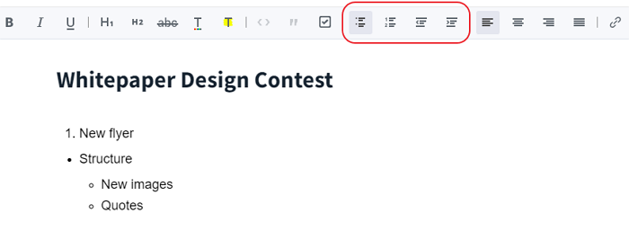
Create lists and adjust indents
Alignment
For further formatting of your text you have the choice of four different alignment options. Select the text and choose between "Align Text Left", "Center" (selected here), "Align Text Right" and "Justify".
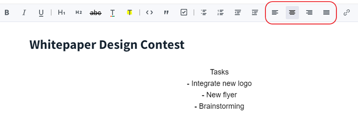
Change the alignment of your text
Emojis and stickers
Clicking on the emoji symbol opens a new window where you can choose from different emojis (emojis can also be inserted into the title of the page) and stickers and insert them into your text. This way you can visualize certain points in your text or mark them as important (e.g. with a warning sign).
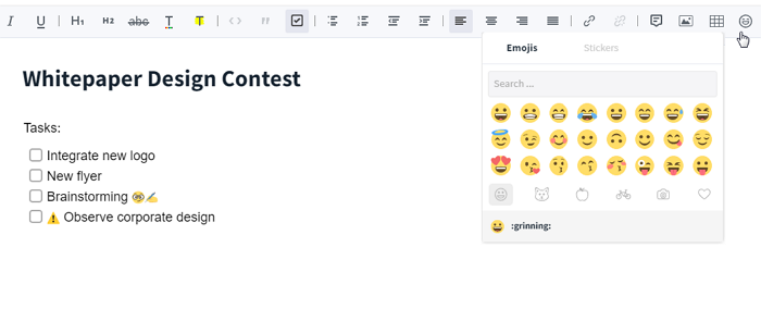
Insert emojis and stickers
Code
Clicking on the "Code" option (symbol: < >) opens a window with a purple background where you can insert code fragments directly in the correct markup.
Alternative: Snippets.
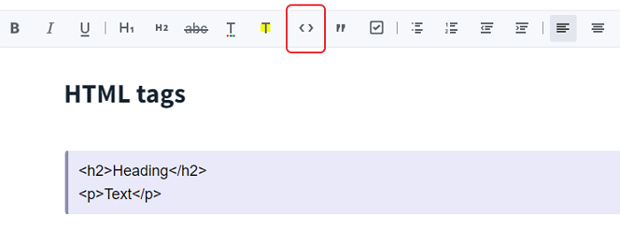
Insert code
Inserting links and files
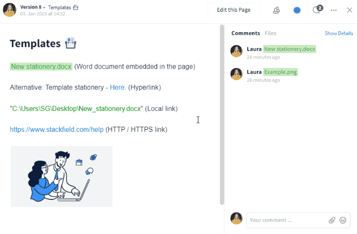
Links and files are embedded or displayed in the pages module as follows:
- Files (Word, Excel etc.): as a green highlighted link to open directly on the page and in the comment section as an attachment in the tab Files
- Exception: image files: directly on the page and in the comment section as a green highlighted link to open and as an attachment in the tab Files
- HTTP / HTTPS links: as a clickable blue link on the page or as a hyperlink displayed as text (a word / text will also be displayed in blue and the link will appear via mouseover)
- Local links to files / folders (premium feature): as clickable green links on the page
Inclusion of files
Insert via image symbol
Files (Word, Excel etc.), images, and links can be inserted into the page via the image symbol. By clicking on it, you can select the location (e.g. "Computer") of the file from the drop-down menu that now appears and upload it from there by clicking on the respective option. Images appear directly on the page, for file types like Word, etc. the title / name is stored on the page. In the comment section, the file is attached and can be opened. Alternatively, files can also be uploaded, for example, in the module Files and their link can be copied and then deposited as a reference via a hyperlink on the page at the desired passage or uploaded from the module to the page (option: "From this room"). If not every user has access to a file, e.g. because it is located in another room, you can also create a public link. Local links to files or folders stored on your computer (if enabled by your organization) can also be added using the image symbol. The page will then contain a clickable green link that will take you to the respective file.
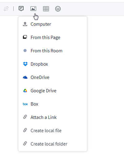
Dropdown menu with all options for including files
Note: Depending on your organization's settings, not all options may be displayed, for example, certain integrations may be disabled, local links may not be enabled, or you may not be using the desktop app.
Insert image with Ctrl or Cmd + V and change size
Insert as a hyperlink (only for HTTP / HTTPS links)
By clicking on the link symbol ("Insert Hyperlink"), you can insert hyperlinks. This way, you can create links to content from other services as well as links created in Stackfield, e.g. to tasks, files or rooms. To create a link, simply highlight the text you want to link to and then click the link symbol. Now a text field opens where you can paste the previously copied link. With "OK" or Enter the link is created. The respective text now appears in blue and the saved link is displayed by mouseover. By clicking on the text, you will be forwarded to the corresponding location, e.g. a stored file, and can open it. If you want to remove a hyperlink, you can highlight the text and click on the strikethrough link symbol ("Remove Hyperlink").
Insert and delete hyperlinks
Inserting and editing tables
To create a table, click on the table symbol and select how many rows and columns your table should have via mouseover over the grid. Now you can create the table by clicking on your selection.
By right-clicking on the table, an additional black toolbar appears, with which you can edit the table. Via mouseover on the different symbols you can show the respective functions. With the help of the first four options, you can subsequently insert rows above / below or columns to the left / right (plus sign at the respective symbol). With the two options next to it, you can delete either the row / column in which the cursor is placed or several previously selected rows / columns (minus sign at the respective symbol). Delete the entire table by clicking on "Delete table" (symbol: recycle bin). To change the column width, move the mouse over the inner frame line and drag the column narrower or wider with the double arrow that appears (symbol: ↔).
Tip: All formatting functions from the toolbar can also be used in a table. Images and files can also be inserted.
Create and edit a table
Note: If you want to perform calculations, the use of Excel is recommended. The respective Excel file can be linked if required or the result can be inserted as an image.
How can I collaborate on pages?
If a concrete workflow is to be mapped (i.e. who is to do what and when), then it is recommended to work with tasks and refer to the respective pages.
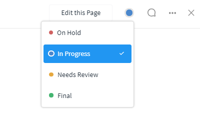
Status
The status is located in the upper right corner of an open page (colored circle symbol, left of "Comments"). It should be adjusted accordingly to make sure all co-workers know the current status. The following statuses are available: On Hold (red), In Progress (blue), Needs Review (yellow), and Final (green).
Status of the page
Tip: In the overview, views can also be created for each editing status using filters, so that only final pages are displayed, for example. In the list view, the status can also be displayed as a column.
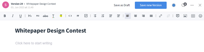
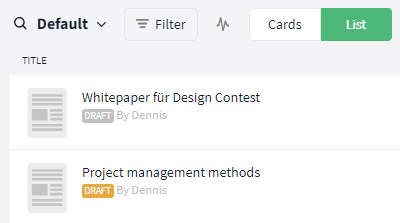
Draft
Once you open a page for editing, two choices appear in the upper right corner: "Save as Draft" and "Save new Version". If you want to save your changes, but do not want to create a new version of the page yet, save it as a draft. When closing the page, you will be asked if you want to save your changes as a draft. If you select "Save", the draft will be saved. This will not overwrite a page immediately and the content will only be visible to the creator in the room and in My Week.
Selecting "No" will discard the draft and your changes will be lost. A draft can also be deleted by clicking on the more button (symbol: three dots) and selecting "Delete". As an indication of current editing, your own drafts are marked with an orange label, and other people's drafts are marked with a gray label. If another person saves a new page, the respective previously saved versions can still be accessed and restored, if necessary.
Indications of the existence of a draft
Versioning
An open page or draft that is being edited ("Edit this page") can be updated with the option "Save new Version".
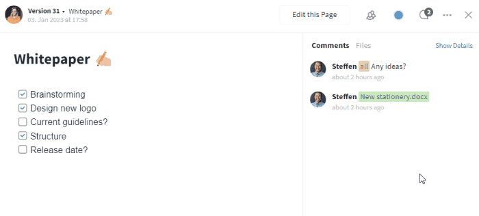
If a new version has been saved, it is noted in the comment section. The version number is noted in the upper left corner. Clicking on it opens a list with all versions. The required version can then be easily selected and viewed. By clicking on the individual versions, the profile (picture) of the respective creator and the date incl. time are also displayed to the left of the version number.
Switch between different versions
Comments, history and attachments
The comment function can be displayed on the opened page by clicking the speech bubble in the upper right corner. The comment section then opens on the right side. The text field can be used to leave comments here, an @-mention can be used to address users directly / ask them a question, and a link or #-mention can be used to refer to other elements. You can also use the paperclip symbol to attach files. All attached files can be viewed in the tab Files.
Furthermore, you can leave comments directly at the point to be clarified within a page. This can be done via the speech bubble in the toolbar after the respective passage on the page has been marked.
Create and check off remarks
All activities can be shown or hidden using the "Show Details" / "Hide Details" button. Each upload of a new version adds a comment as a note indicating the change. This way you can always see which version a comment refers to.
Show / hide history and switch between comments and files
How can I design the layout of pages?
In the pages module, all pages can be visualized as lists or cards visible to all authorized members and you can also create folders, for example.
Options:
The relevant view can be modified and saved according to your own requirements (See also: filters). Sometimes the view also needs to be updated (Notifications within a room).
List
Change the display in the module in the upper right corner (below the navigation bar, between filter and plus symbol) using the "List" button. Only the title is displayed in the list by default. However, you can also display additional information (such as labels) by clicking the "MORE" button in the overview or the "Columns" list within the filter section.
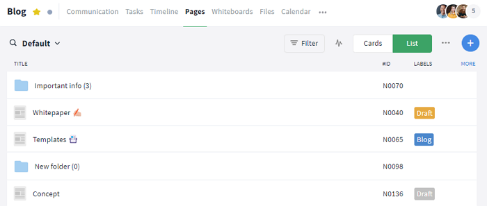
Display of pages in a list
Cards
The display can be changed in the upper right-hand corner of the module (below the navigation bar, between the filter and the plus symbol) using the "Cards" button.
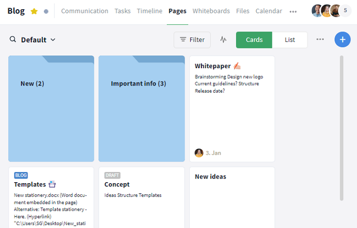
Display of pages as cards in a board
Further functions
Options for admins
If you have any questions about the features, your plan or upgrading to the Premium plan, just contact our Support, we'll be happy to help.
Further articles