In Stackfield, you can use whiteboards to prepare and present content, ideas, and information using various editing options.
Reading tip: Whiteboards are here!
Potential use cases for whiteboards:
- Flowcharts / Processes
- Mood boards
- Presentations
- Roadmaps
- Concept maps
Creating a whiteboard
In the module Whiteboards a whiteboard can be created either completely from scratch or a template by clicking on the blue plus button at the top right. By clicking on the placeholder "Untitled" in the top left-hand corner, you can name your whiteboard and change the title at any time. To avoid duplicates, use the module search (symbol: magnifying glass, top left).
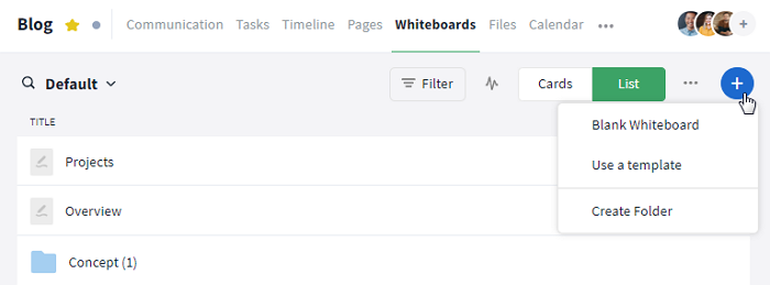
Click on the blue plus icon to create a new whiteboard
Alternatively, whiteboards can also be created using the following modules or areas:
- Module Communication: Click on the plus symbol to the left of the text field and then select the option "Whiteboard" to create a new whiteboard.
- Sidebar: A new whiteboard can also be created via the sidebar by clicking on the button "+ Create New". By default, the whiteboard is created in the room in which you were last present.
- Global Search: Through the Control Center of the global search you can navigate through Stackfield, create module entries, including whiteboards, and much more.
How can I fill whiteboards with content?
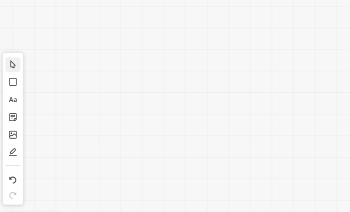
In a newly created whiteboard or one that has been opened for editing ("Edit this Whiteboard"), you have various editing options. Depending on the use case, you can use the toolbar to insert shapes, images, or texts and connect them with arrows. By moving the mouse over the individual symbols in the toolbar, the respective functions of the individual options are displayed. The individual options are explained below.
Note: Whiteboard contents can only be edited in edit mode, i.e. by clicking on "Edit this Whiteboard". If you are in edit mode, this button then changes to the save buttons.
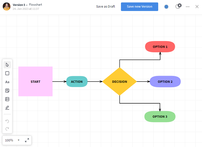
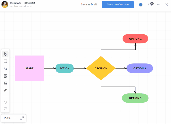
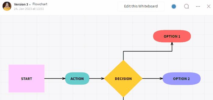
Opened whiteboard with flowchart as an example
Customize the view in the open whiteboard
When you open a new whiteboard, a white canvas, a toolbar on the left, and a zoom button at the bottom left appear. You can use the more button (symbol: three dots) at the top right to show or hide a grid for orientation. Click on "Show Grid" and a green tick appears. The function is now active and the grid is displayed on the whiteboard. If you click on this option again, it is undone and the grid is removed. You will also find the option "Snap to Grid" here, which you can use to align your content.
Show / hide grid and use zoom
Using the zoom button you can enlarge and reduce the view and switch to full-screen mode. By clicking on the arrow next to the percentage, a drop-down list appears with different magnification levels between 50% and 300% (maximum limit). You can also adapt the whiteboard to your content ("Fit to Content") or your content to the width of the whiteboard ("Fit to Width"). If you place a green tick in one of the two lower options, this happens automatically. Click on "Full Screen" (symbol: diagonal arrows) to switch to full-screen mode and click again to exit.
Tip: If you hold down Ctrl / Cmd and scroll with your mouse at the same time, you can set individual zoom levels and even reduce your view down to 5%.
Insert and edit elements
The following elements / functions are available in the whiteboard and can be inserted or applied as follows:
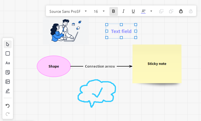
All elements in the whiteboard
- Shapes (Symbol: square): If you select this option, another selection window appears from which you can select a shape and insert it by clicking on the whiteboard.
- Text fields (Symbol: Aa): If you have selected this option, you can insert a text field by clicking on the whiteboard.
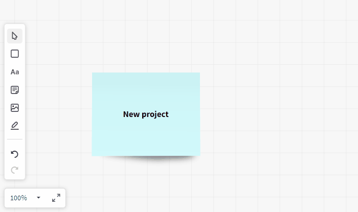
- Sticky notes (Symbol: sticky note): If you select this option, another selection window appears and you can choose from different colored sticky notes. Then click on the whiteboard and the element is inserted.
- Images (image symbol): By clicking on this option you can choose whether you want to insert an image from your "Computer", "From this Whiteboard" or "From this Room".
- Drawing function (pencil symbol): When you select this function, another window appears in which you can select the thickness and color. Instead of the mouse pointer, a pencil now appears with which you can draw on the whiteboard.
- Connection arrows: After inserting an element, the connecting arrows appear automatically as soon as you select one of the green formatting points and drag the mouse pointer to the side. You can change the direction of the arrow by dragging it (up, down, or straight ahead). If you release the left click, a selection window appears from which you can select another shape that is then inserted at the end of the connection arrow. (Create flowcharts this way, for example.) You can also connect existing elements in this way. (Tip: Connection arrows can also be labeled by double-clicking on them.)
Connecting elements
Select / Place
Once you have inserted an element, you can select it again by simply left-clicking on it and place it anywhere on the whiteboard. You can edit it further using the additional toolbar that appears or adjust the size of the element. (Note: To select and edit drawings, you must first close the selection window by clicking on the "X" or select the mouse symbol in the toolbar).
Tip: You can also move and edit several elements together within the whiteboard. To do this, hold down the left mouse button and move the mouse over the elements you want to select or select all elements on the whiteboard with the key combination Ctrl + A (or Cmd + A ). The blue formatting frame then encloses all the marked elements.
Change size / height / width
If you click on an element, a blue formatting frame appears with which you can drag all elements higher / lower or wider / narrower using the center points or enlarge / reduce the entire element using the corner points.
Changing the size of an element
Further editing functions
For further editing, an additional toolbar with various editing options appears when elements (e.g. shapes) are inserted or right-clicked. Mouse over the individual options to see an explanation of the respective function.
Insert text / Text formatting / Color design
All elements (except drawings) can also be filled with text or labeled by double-clicking on the respective element. For all elements that can be filled with text, i.e. shapes, text fields, sticky notes, images, and connection arrows, the font can be formatted, i.e. font type and size (drop-down lists), bold (symbol: B), italic (symbol: I) and underlined (symbol: U), as well as the respective text color (symbol: A) can be changed. For shapes, for example, the line color (symbol: underlined circle) and the fill color (symbol: paint bucket) can also be adjusted.
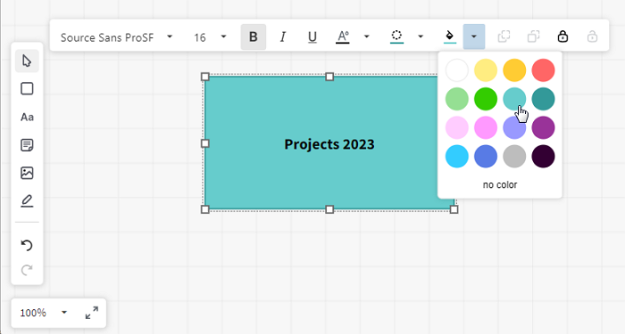
Use the additional toolbar to change the fill color
Move elements to the foreground / background
Individual elements can be moved to the foreground ("Bring to Front") or background ("Send to Back") (symbols: overlapping squares) via the respective function in the toolbar or by right-clicking on an element.
Move elements to the foreground / background
Lock / unlock elements
With the option "Lock" (symbol: closed lock) in the toolbar, you can also fix elements to a position in the whiteboard so that they remain in the defined position and can no longer be moved or edited. When you click on locked elements, you can also recognize them by the "x" in the corners. To be able to move / edit the element again, click on "Unlock" (symbol: open lock). The option "Lock" also appears with a right click and after selecting and right-clicking again, the option "Unlock" appears.
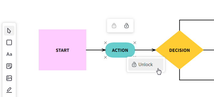
Displaying and unlocking locked elements
Overview of the editing options
Here is a brief summary of which elements can be edited and how:
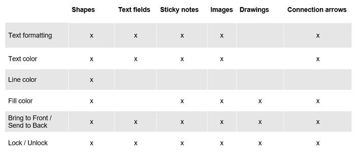
Overview editing options
Remove / Undo / Restore
With the two arrows in the left toolbar, previous entries and formatting can be undone or restored. A selected or highlighted object can also be deleted with the Del key (or Fn key and Backspace key).
How can I collaborate on whiteboards?
If a concrete workflow is to be mapped (i.e. who is to do what and when), then it is recommended to work with tasks and refer to the respective whiteboards.
Especially if several people are involved in the creation of a concept or a presentation or if you want to exchange ideas with your team (e.g. in a mood board), the use of whiteboards is recommended. For brainstorming with your team, you can work together with a whiteboard via screen transmission in a conference (see: versioning).
Status
The status is located in the upper right corner of an open whiteboard (colored circle symbol, left of "Comments"). It should be adjusted accordingly to make sure all co-workers know the current status. The following statuses are available: On Hold (red), In Progress (blue), Needs Review (yellow), and Final (green).
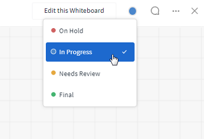
Status of the whiteboard
Tip: In the overview, views can also be created for each editing status using filters, so that only final whiteboards are displayed, for example. In the list view, the status can also be displayed as a column.
Draft
Once you open a whiteboard for editing, two choices appear in the upper right corner: "Save as Draft" and "Save new Version". If you want to save your changes, but do not want to create a new version of the whiteboard yet, save it as a draft. When closing the whiteboard, you will be asked if you want to save your changes as a draft. If you select "Save", the draft will be saved. This will not overwrite a whiteboard immediately and the content will only be visible to the creator in the room and in My Week.
Selecting "No" will discard the draft and your changes will be lost. A draft can also be deleted by clicking on the more button (symbol: three dots) and selecting "Delete". As an indication of current editing, your own drafts are marked with an orange label, and other people's drafts are marked with a gray label. If another person saves a new whiteboard, the respective previously saved versions can still be accessed and restored, if necessary.
Indications of the existence of a draft
Versioning
An open whiteboard or draft that is being edited ("Edit this Whiteboard") can be updated with the option "Save new Version".
If a new version has been saved, it is noted in the comment section. The version number is noted in the upper left corner. Clicking on it opens a list with all versions. The required version can then be easily selected and viewed. By clicking on the individual versions, the profile (picture) of the respective creator and the date incl. time are also displayed to the left of the version number.
Switch between different versions
Comments, history and attachments
The comment function can be displayed on the opened whiteboard by clicking the speech bubble in the upper right corner. The comment section then opens on the right side. The text field can be used to leave comments here, an @-mention can be used to address users directly / ask them a question, and a link or #-mention can be used to refer to other elements. You can also use the paperclip symbol to attach files. All attached files can be viewed in the tab Files.
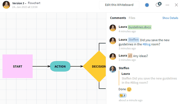
The comment section in the whiteboard
All activities can be shown or hidden using the "Show Details" / "Hide Details" button. Each upload of a new version adds a comment as a note indicating the change. This way you can always see which version a comment refers to.
How can I design the layout of whiteboards?
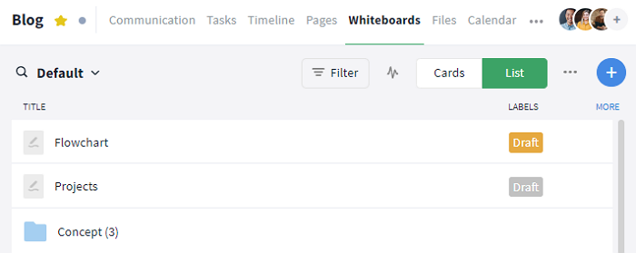
In the whiteboards module, all whiteboards can be visualized as lists or cards visible to all authorized members and you can also create folders, for example.
Options:
The relevant view can be modified and saved according to your own requirements (See also: filters). Sometimes the view also needs to be updated (Notifications within a room).
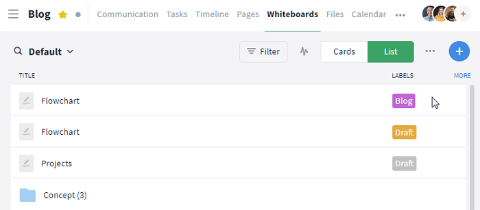
List
Change the display in the module in the upper right corner (below the navigation bar, between the filter and the plus symbol) using the "List" button. Only the title is displayed in the list by default. However, you can also display additional information (such as labels) by clicking the "MORE" button in the overview or the "Columns" list within the filter section.
Display of whiteboards in a list
Cards
The display can be changed in the upper right-hand corner of the module (below the navigation bar, between the filter and the plus symbol) using the "Cards" button.
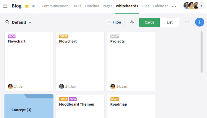
Display of whiteboards as cards in a board
Further functions
Options for admins
If you have any questions about the features, your plan or upgrading to the Premium plan, just contact our Support, we'll be happy to help.
Further articles